StorybookのControlsタブを使ったpropsの制御
date
Jan 1, 2023
repo_url
slug
storybook-controls
status
Published
summary
type
Post
thumbnail_url
tags
storybook
outer_link
StorybookのControlsタブではコンポーネントに渡すpropsを制御できます。
その場合はStorybookからコンポーネントへpropsを渡すため、テンプレートを作成し、各ストーリーをテンプレートのbind関数を使って作成します。
制御したいデータはメタデータの中のargTypesで定義します。
以下の例ではボタンの色と表示するテキストをStorybookから制御できるように設定しています。
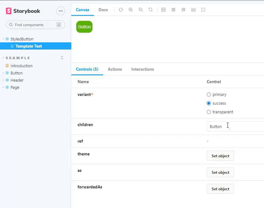
Storybook上で確認すると、Controlsタブでvariantとchildrenのためのフィールドがあり、それらを編子うするとコンポーネントの表示を変えることができます。
import { ComponentMeta, ComponentStory } from '@storybook/react';
import { StyledButton } from '../components/StyledButton';

// ファイル内のstoryの設定(メタデータオブジェクト)
export default {
  //グループ名
  title: 'StyledButton',
  //使用するコンポーネント
  component: StyledButton,
  argTypes: {
    // propsに渡すvariantをStorybookから変更できるように追加
    variant: {
      // ラジオボタンで設定できるようにする
      ontrol: { type: 'radio' },
      options: ['primary', 'success', 'transparent'],
    },
    // propsに渡すchildrenをStorybookから変更できるように追加
    children: {
      // テキストボックスで入力できるようにする
      control: { type: 'text' },
    },
  },
} as ComponentMeta<typeof StyledButton>;

// テンプレートコンポーネントを実装
// Storybookから渡されたpropsをそのままButtonに渡す
const Template: ComponentStory<typeof StyledButton> = (args) => (
  <StyledButton {...args} />
);

// bind関数を呼び出しStoryを作成
export const TemplateTest = Template.bind({});

// デフォルトのpropsを設定する
TemplateTest.args = {
  variant: 'primary',
  children: 'Primary',
};